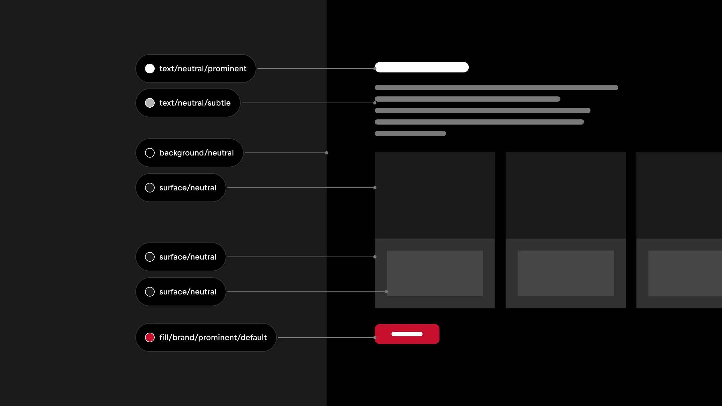
System
Color System
Implementing a color system brings purposeful and intention to colors, removing design-making and consistent application.
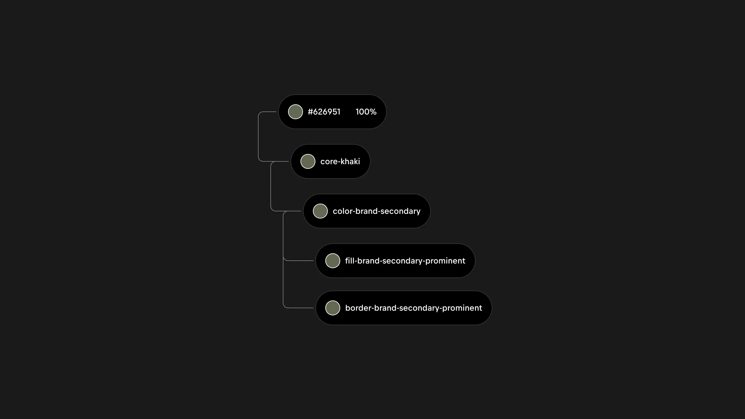
Aliasing color tokens
Aliasing color tokens to core values allows global brand color updates by changing just the core token, preventing inconsistencies and making rebranding effortless. It also enables seamless theme switching by remapping semantic tokens to different core palettes without touching individual components.
Token structure
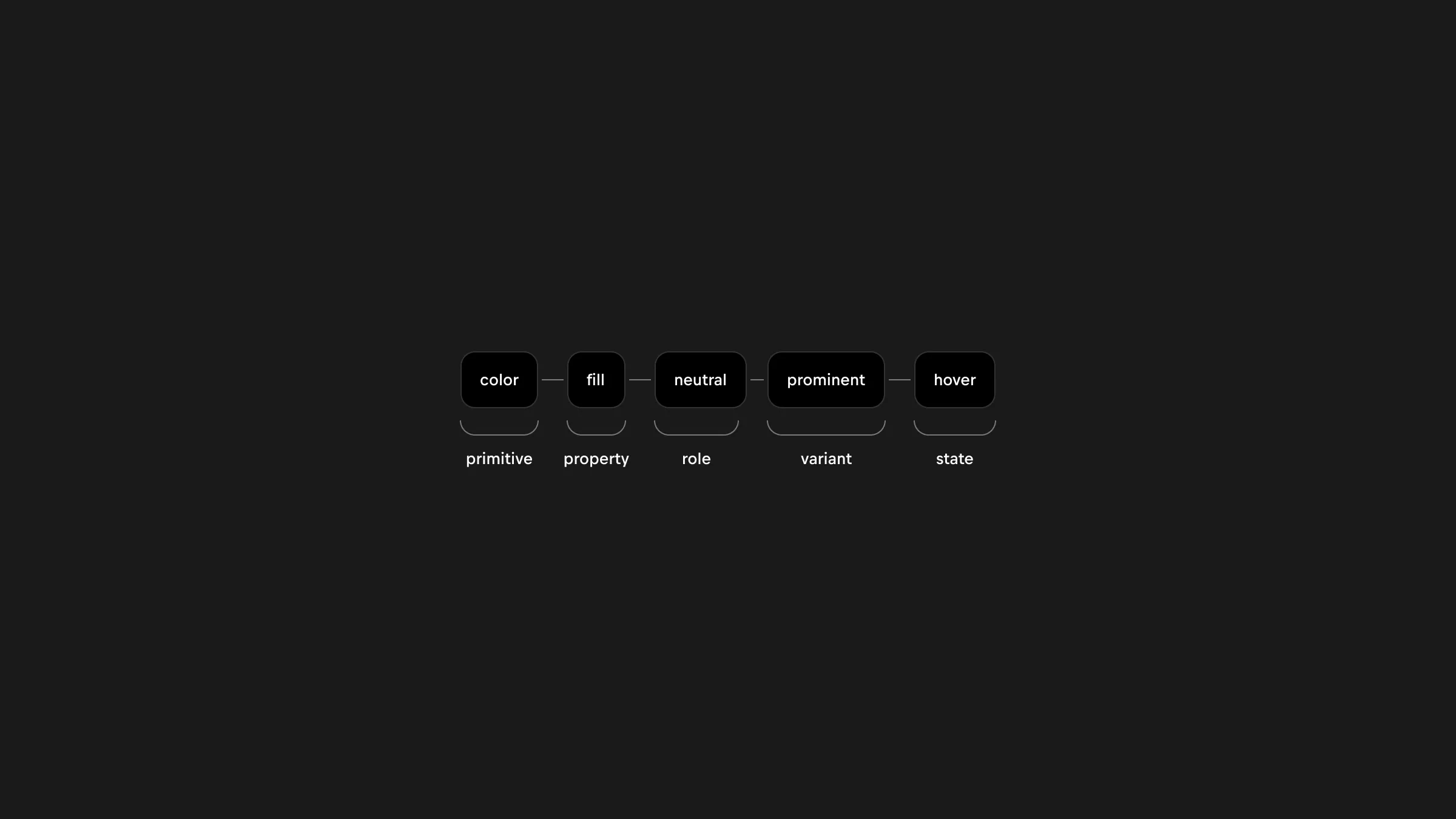
Colors are organized in a system that assigns purpose to color. Purpose is defined by a few key decisions which include the following.
Values are not included when a color doesn't require further distinction.
Properties
Assigns a scope of color application.
Property | Description |
|---|---|
Background | Baseline colors for the entire interface; only other background colors can sit side by side, not layered. |
Surface | Larger UI elements like cards, banners, tables, and modals; provides hierarchical levels for emphasis. |
Fill | Background colors for smaller surface areas like buttons and badges. |
Border | Used primarily in data tables to enhance structure and separate information. |
Text | For all text elements. |
Icon | Exclusively for icons. |
Roles
Assigns meaning for consistent application.
Role | Description |
|---|---|
Neutral | Baseline, un-opinionated role. |
Neutral inverted | The same as neutral but oppositei color, typically a light or dark version. |
Branded | Typically making use of the brand’s primary color. |
Variants
Assigns a hierarchy level to the property.
Variant | Description |
|---|---|
Prominent | Of high importance, such as critical messages or primary actions. |
Subtle | Of medium importance, such as subtitles or detailed content. |
Muted | Of low importance, such as dividers that subtly seperate content. |
States
Communicates the state of a UI element.
State | Description |
|---|---|
Default | An interactive UI element is not being interactive with. |
Hover | User is hovering on an interactive UI element. |
Active | UI element is actively being interacted with. |
Disabled | Indicating a disabled state, typically greyed out. |